

Design 101: Fonts To The Rescue

We are now fully into this new blog series and moving our way through the different aspects of design. During our first week, we shared about our history with graphic design as well as layers and the ultimate importance of them. Last week we looked at colors; we discussed some of the different vocabulary associated with it as well as the different color relationships like monochromatic and tetradic. This week, though, we’ll be shifting to another highly recognizable piece of graphic design: typography.
Why focus on typography?
Like most elements of design, typography is a chance to create hierarchy within a design and leave your audience with an impression of your company or brand. We’re going to be focused today mainly on the different types of fonts and some helpful tips, but it’s important to remember that the way you use text is bigger than that. The boldness or lack of it, the spacing, size, and color of your text can communicate just as effectively as the font you choose.
How are fonts characterized?
There are tons of different fonts available online and even within your standard word processing document. So, while the exact amount of categories is subjective, we’re going to define five basic categories that we think adequately cover the world of typography.

Serif Fonts
Serifs are the oldest type of fonts, and honestly, they can be broken down into quite a few subcategories such as Old Style and Transitional. They are named this, though, because “serif” refers to the small feet present at the tops and bottoms of each individual letter.
Serifs are particularly helpful in creating logos since the letters are easily read, and honestly, they are still some of the most popular typefaces today. Most books and documents we read utilize the favorites in this category like Times New Roman. Serif fonts tend to communicate a sense of elegance or sophistication, and in design, they tend to help companies seem more established.

Slab Serif Fonts
While a variant of the traditional serif typeface, this category distinguishes itself by having bolder and heavier fonts. The feet are larger and bolder, which is how it gains the term “slab.” They gained prominence in the 1800’s and were used to draw attention in advertisements and pamphlets.
In designs, slab serifs tend to bring a vintage feel due to their heyday in the 19th Century. They are still used today when the intention is to make a bold statement.
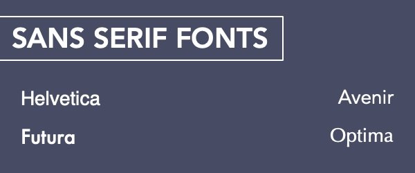
Sans Serif Fonts
Sans Serif fonts are unsurprisingly a class of fonts that are without the little feet. They project a clean, modern feel and are defined by their clean, straight lines. These efficient, clean fonts rose to prominence in the early 20th century, and many of them such as Helvetica and Arial remain popular to this day. They are readable at a large range of sizes, and while they are often used for longer pieces of text, they can still shine in a logo or headline.
(And yes we are currently using a Sans Serif font on our website and this blog.)

Script Fonts
Script fonts are exactly what they sound like and are known for their natural-looking cursive style. They are defined by their swashes, their flourishes and curls. Their major subcategories are a little easier to keep track of since they break down into formal or casual. Casual script fonts tend to contain less swashes and emphasize legibility.
It’s recommended that script fonts are used sparingly in designs since they can negatively impact readability. However, they are useful in projecting a sense of elegance and timelessness.

Decorative Fonts
Decorative fonts are the largest and most diverse category in the world of typography. They are typically unique and appealing typefaces that don’t conform to the rules of the above groups. They are rarely used for long pieces of text, but they find a lot of use in signage, logos, and headlines. Generally, fonts in this category convey a sense of fun, originality, and uniqueness. We find them particularly helpful in designs focused on specific events and holidays.
General Tips:
Serif and sans serif fonts pair beautifully together. Serifs are usually preferred for long pieces of text in print while sans serifs are preferred for longer texts digitally.
Don’t be afraid of contrast. In design, this often leads to some of the best results. This doesn’t just apply to the font itself. Don’t be afraid to experiment with italics, boldness, size, weight, spacing, and color.
Script and decorative fonts can be useful, but don’t overuse them. They can negatively affect readability.
Don’t use two fonts that are too similar. It makes it difficult to establish hierarchy for the information, and changes between the two fonts can look like a mistake instead of intentional.
Bold headlines and keep the body of the text light for easier readability.
Limit your number of fonts for projects. While you can use more than five fonts on a project, most designs will only require two or three for effectiveness.
So, which fonts do you find the most appealing? Which type do you use the most?
We want to know, so feel free to leave us a comment below. We’re always curious to know what type of fonts people prefer. Also, stay tuned to the blog throughout this month as we lay out one more aspect of design, and if you are in need of graphics, you can always check out how we can help here.